
1. Shades of Earth by Beth Revis - I'm not sure what happened with this cover. The one for Across the Universe is absolutely gorgeous, with so many colors and the silhouettes. This is pretty ugly.

2. All These Things I've Done by Gabrielle Zevin - This is the paperback cover (and the sequels are designed in the same vein). I'm just not a fan. It looks too futuristic, like the cover is trying too hard.

3. The Casual Vacancy by J.K. Rowing - So boring! Especially after the beautifully illustrated HP covers.

4. The Splendor Falls by Rosemary Clement-Moore - Not really a fan of the purple rose.

5. Delirium by Lauren Oliver - I don't like this redesigned cover as much as the original. The face of a girl staring at the camera is always used - it's so boring!

6. The Forest of Hands and Teeth by Carrie Ryan - The original wasn't amazing but I seriously don't like this one. Why is she wearing eyeliner?!? There was definitely no makeup in this post-apocalyptic world.

7. Isla and the Happily Ever After by Stephanie Perkins - This doesn't match the first two in the trilogy so I'm not quite sure what to make it. I would definitely redesign to fit with the others.

8. Wolfsbane by Andrea Cremer - The model's pose is so awkward and I'm not a fan of the green or the huge moon.

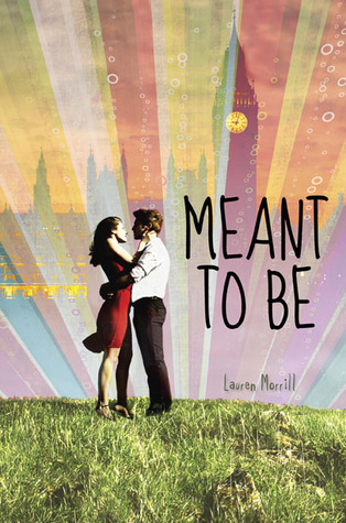
9. Meant To Be by Lauren Morrill - I'm currently reading Meant To Be and the cover doesn't capture the awesomeness of London. How can you not have a picture of a double decker or something?!
10. Sever by Lauren DeStefano - I hate the background; it looks like a green screen. The model is posed too perfectly. I don't understand how the cover for Wither is so neat while this looks incredibly staged.

2 comments:
I loved meant to be and I agree, the cover doesn't capture it much. That book deserves so much more.
Great list! I really dislike those redesigns of Delirium too, glad we have different ones in the UK. My TTT.
Post a Comment